Beginners Guide to Brush Calligraphy

How to Begin Brush Lettering: A Step-by-Step Guide
Do you see people’s fancy and aesthetic handwriting on Instagram or Pinterest and think to yourself “I wish I could write like that.” You definitely can. ANYONE can learn how to do calligraphy/lettering even if you think you DON’T have GOOD HANDWRITING. I’m here to show you how. It’s easier than you think.
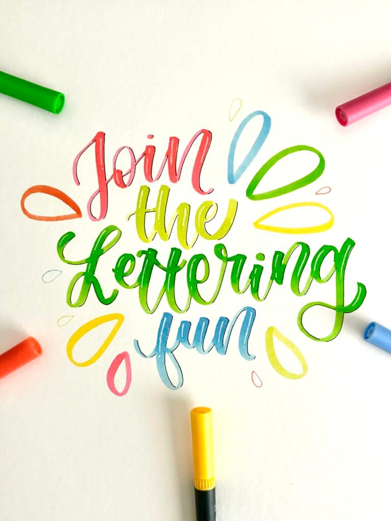
Calligraphy vs Lettering
I’m sure you guys have heard of these terms used interchangably. Are they the same thing?
Essentially, while there are some overlaps, there is a major difference between the two: the technique. Calligraphy is WRITING the letters without any planning beforehand in a slow, controlled manner while lettering is DRAWING the letters, involving sketching and designing the shape of each piece.
When the word “brush” is attached in front of lettering, the term brush lettering describes a style of writing that is similar to calligraphy because of the use of a brush pen where it is irreversible. It is also referred to as modern calligraphy. Now with the basic background information down, let’s talk about the best supplies that’s both beginner-friendly and cost-friendly.
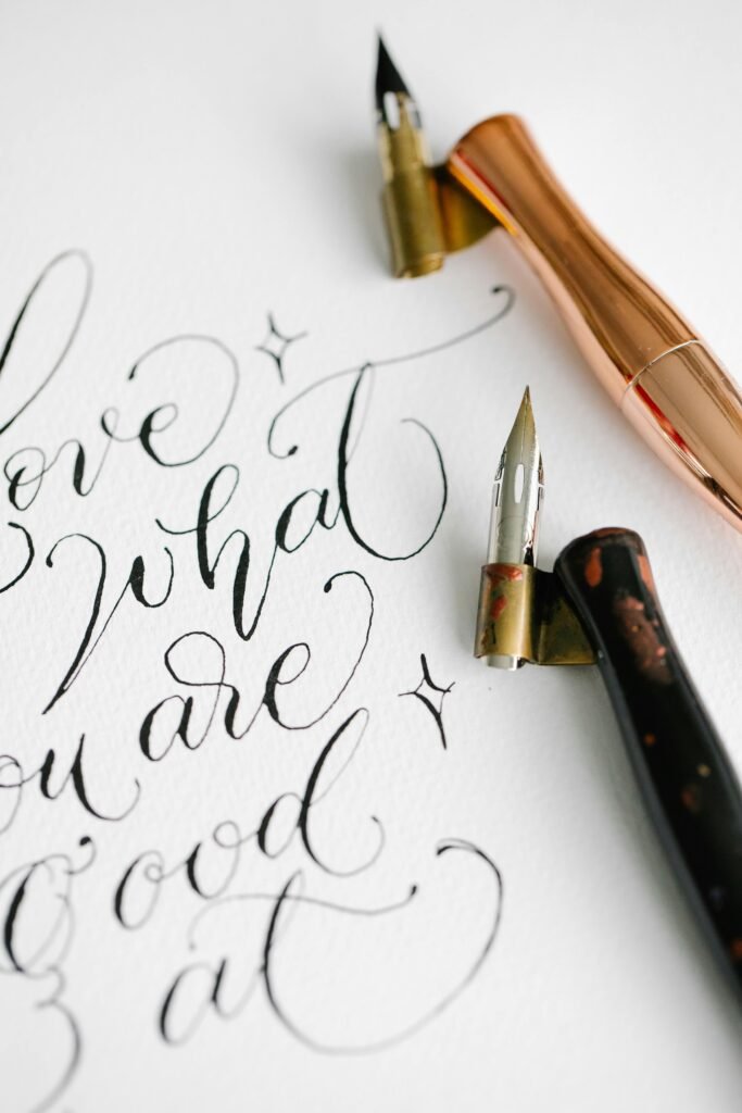
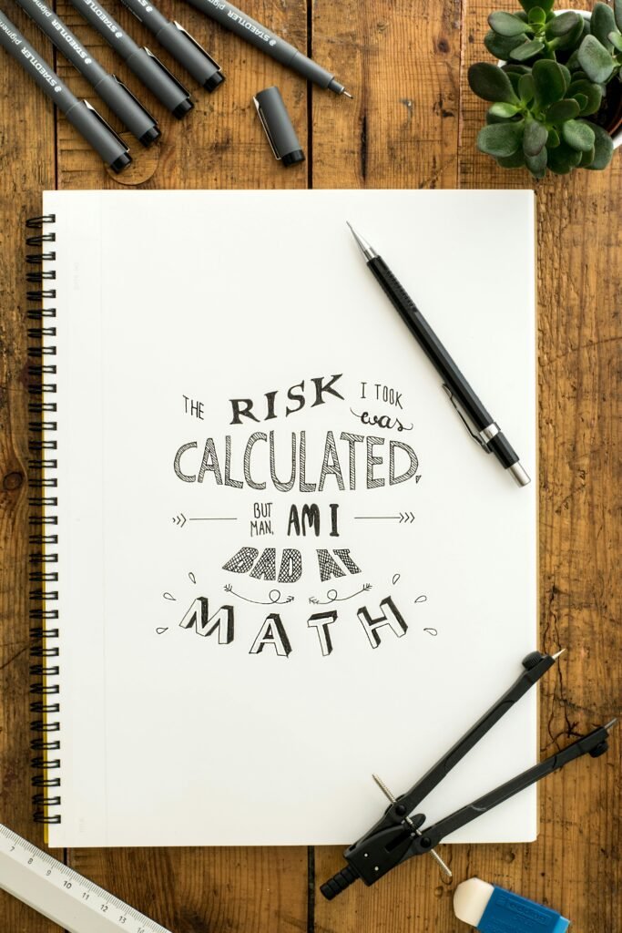
Materials
With a multitude of options for brush pens, calligraphy pens, and paper, one can spend hours pondering which supplies are actually worth the money. My honest answer is to start with what you have at home. I began my calligraphy journey with copy paper and crayola markers. As long as you practice the fundamentals, the supplies matter do not matter so much. However, I have suggestions along with commentary for anyone who needs them so wasting money on the wrong supplies can be a step skipped in your calligraphy journey!
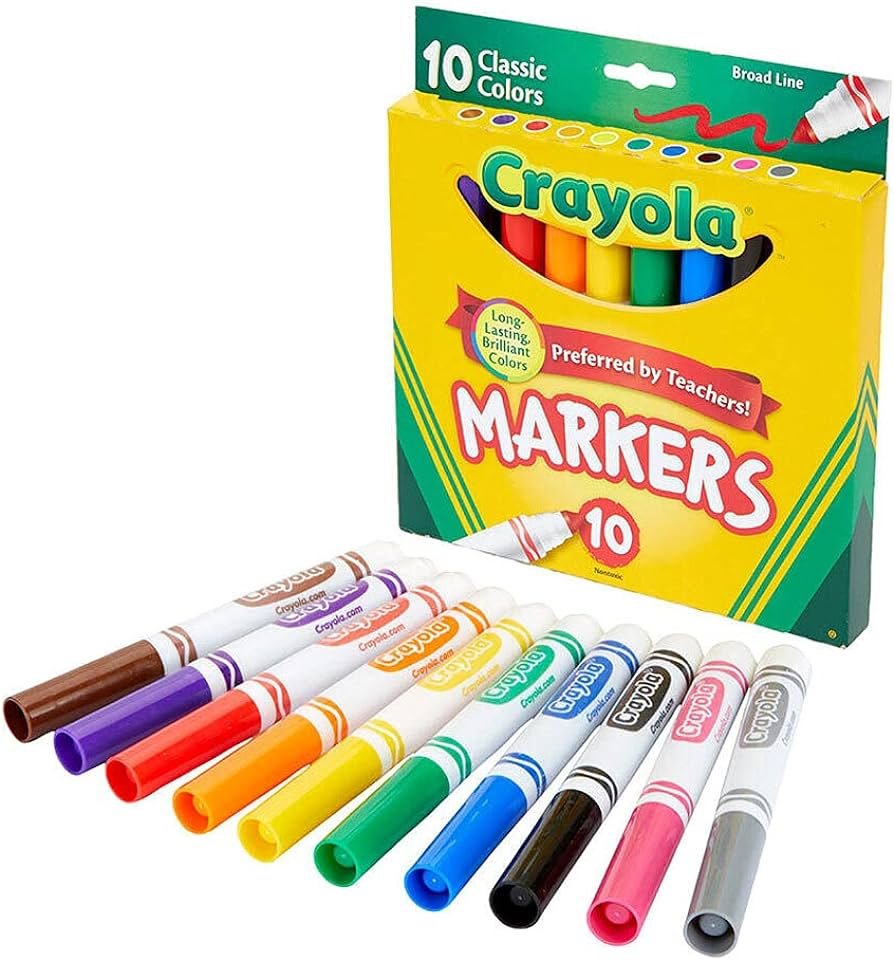
The Big Crayola Markers – the most cost-friendly option that gets the job done; tip is not very flexible but is pressure-sensitive meaning it can create the thick and thin lines needed for basic brush calligraphy ——- even has packs of 40 and 64 if you think the pack of 10 has limited color options
* thin crayola markers do not have the pressure sensitivity that creates the same effect but it can be used for faux calligraphy (fake calligraphy) tutorials on faux calligraphy available on website too
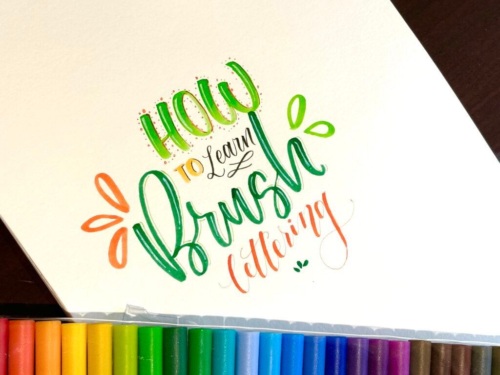
CaliArt double-tipped brush pens – one of my favorites by far with juicy, vibrant pigmentation and a variety of colors for a FAIR price. These brush pens have a flexible soft tip but are bigger tipped brushes which are harder for beginners to control. I recommend starting out with a small tip brush pen like Pentel and Tombow Fudenosuke (2 pack with hard and soft tip) and working your way to larger brush tips. I bought my pack of 34 CaliArt pens for around $15 and I am super pleased with the shades and the natural ombré it creates when lettering.
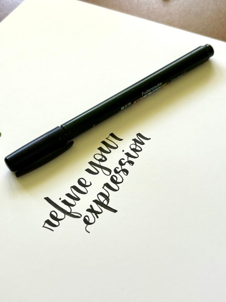
Tombow Fudenosuke (2 pack) – very beginner friendly and cost friendly with a soft tip that creates a thicker downstroke and a hard/firm tip that creates a thinner downstroke but easier to control when transitioning from thick to fine lines. Limited colors – other tombow options have a large brush nip which can be hard for beginners to start with.
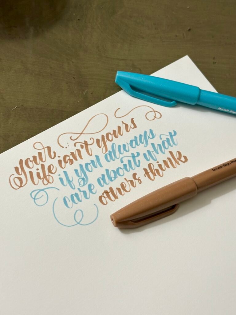
Pentel brush pens – one of the more pricey (24 pens for $23 on amazon) brush pens but definitely a good investment for its firm nib and its ability to create a sharp contrast between thin and thick strokes. It’s definitely my favorite small nib brush pen to use in my notebooks, handmade cards, and bullet journals. Besides the price, these brush pens run out of juice pretty quickly I say (or maybe I just use them a lot without noticing).
Nib Comparsion
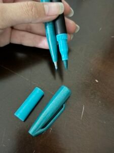
Previously mentioned in the recommended materials list, small brush tips are easier to control than the larger ones. Below is an example of each type so you guys can distinguish between the two.
Paper
Tips
Before beginning with the brush lettering basics here are some tips that can make a real difference
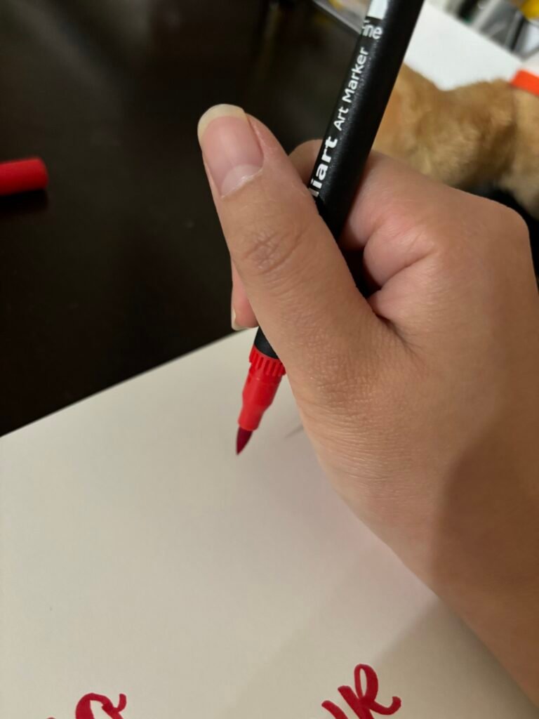
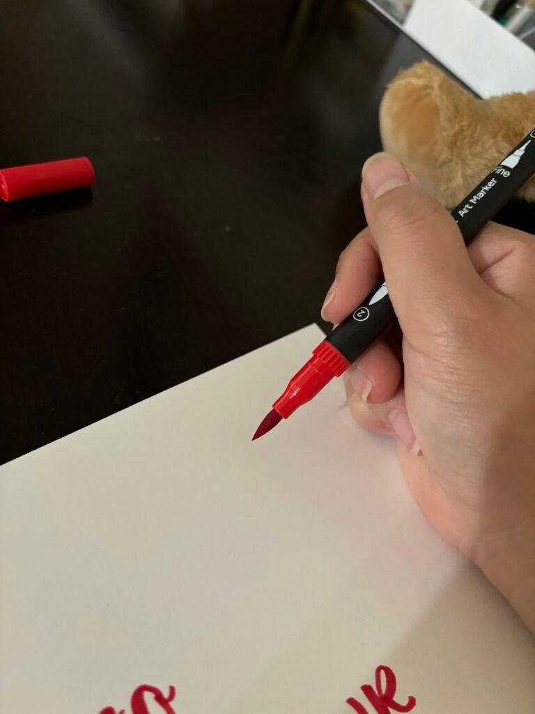
- Hold your brush pen at a slanted angle (around 45 degrees) to get better control when making a downstroke because more surface area of the nib will be on the page to create that pretty thick line
- Do not hold your pen vertically while writing as it will damage the nib overtime
- If there is bleeding on the page, try thicker paper such as card stock or you can even begin on cardboard
3 Steps to Brush Calligraphy
1. Downstroke vs Upstroke
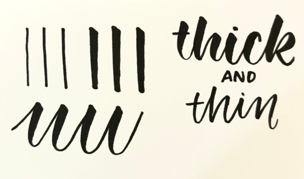
When you create a line starting from the top and ending on bottom, it is called a downstroke (example in picture below). Apply MORE PRESSURE to create a THICKER line.
When you create a line from bottom to top, apply LESS PRESSURE to create a THINNER upstroke.
These variations in thickness are the foundation to brush calligraphy.
2. Loops
When writing letterings with loops or circles such as o, p, and b, it’s important to follow the same concept of downstrokes and upstrokes. Although it is more difficult to pinpoint where the downstroke and upstroke ends sometimes, be sure to follow the natural flow of the letter by practicing.
3. Variation
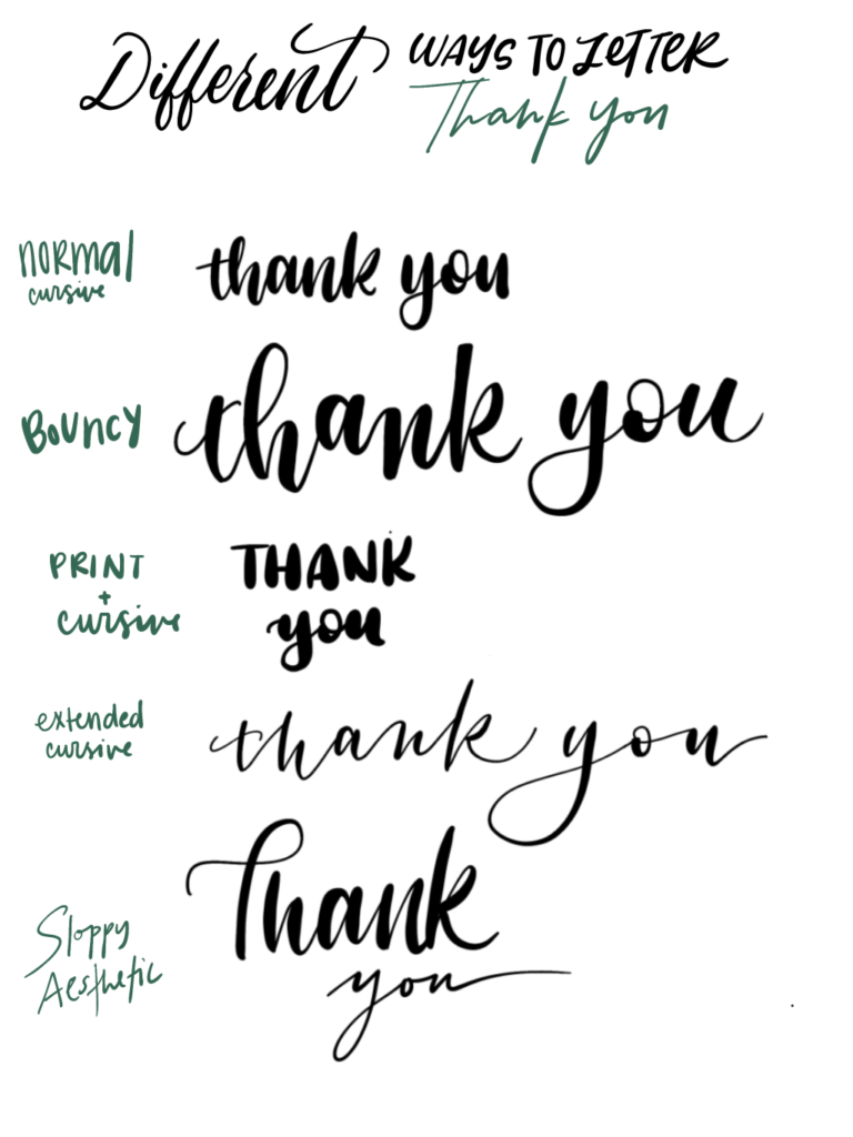
Spice your calligraphy up a bit with bouncier letters, different spacing, and alternate between one style and the next (this can simply be one word in cursive and the next word in print. Play with the space you have, make words stack on top of each other. It’s up to you! If you need inspiration, look at the works gallery on this website!

Now Time To Practice
1 comment
Leave a Reply Cancel reply
Author
jasmineye30@gmail.com
Related Posts
Learning Faux Calligraphy: How to Fake Calligraphy
A popular method to achieve the look of calligraphy without the actual tools, faux calligraphy provides an alternative approach to lettering. In...
Read out all
Calligraphy with Flourishing and Creating Shadows
What is Flourishing? One of the key elements of calligraphy is flourishing, which is adding decorative details around the letters and words....
Read out all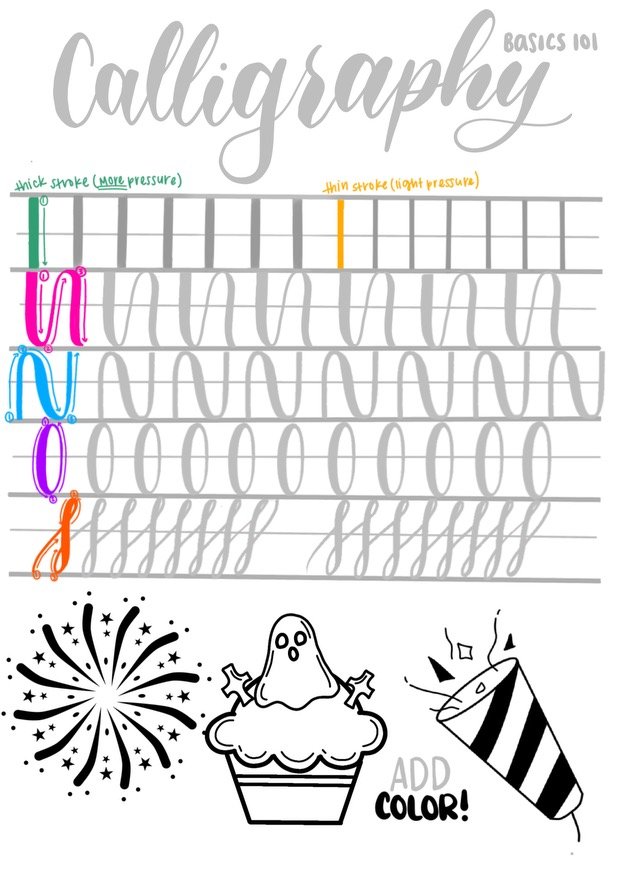

Greetings! Very helpful advice in this particular article!
It’s the little changes that make the largest changes.
Many thanks for sharing!